Build a Seller Review Dashboard From Complaint Themes and Praise Patterns
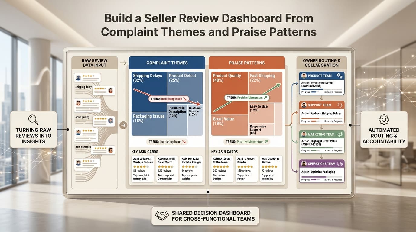
Most teams do not struggle because they lack customer feedback. They struggle because the feedback is scattered across review tabs, spreadsheets, screenshots, and one-off Slack messages. A seller review dashboard solves that problem by turning repeated complaints, praise patterns, and trend shifts into one shared operating view.
This is where Amazon review sentiment analysis becomes practical. Instead of stopping at positive, neutral, and negative labels, the team uses a dashboard to see what buyers keep repeating, which ASINs are involved, how fast a theme is growing, and who should act first.
For ecommerce teams, the goal is not a prettier chart. The goal is a working system that helps product, support, operations, and marketing read the same customer signal and make faster decisions.
What a seller review dashboard should actually answer
A useful dashboard should help the team answer questions like these:
- Which complaint themes are rising this week?
- Which praise patterns are strong enough to reuse in listing copy?
- Are the issues concentrated in one ASIN, one variation, or the full catalog?
- Is the problem caused by product quality, packaging, expectation mismatch, or support friction?
- Which owner needs to act first?
If the dashboard cannot answer those questions, it is not doing much more than storing sentiment labels.
Why complaint themes and praise patterns belong in the same dashboard
Many teams focus only on negative reviews because the pain feels urgent. That is a mistake. Complaint themes and praise patterns do different jobs, and both matter.
Complaint themes help teams:
- catch product or packaging issues earlier,
- identify expectation mismatch before returns climb,
- update support guidance,
- and prioritize what needs investigation first.
Praise patterns help teams:
- understand what buyers value enough to mention repeatedly,
- sharpen titles, bullets, and image captions,
- identify positioning language for ads,
- and protect the features customers already love.
That is why the dashboard should show both sides together. A product can have growing complaints about instructions while still earning strong praise for durability or comfort. Teams need both signals to act well.
The five layers every seller review dashboard needs
The cleanest dashboard structure is usually a five-layer model.
| Layer | What it shows | Why it matters |
|---|---|---|
| Theme summary | Top complaint themes and top praise patterns | Gives the team one fast read on what buyers keep repeating |
| Trend movement | Rising, falling, and newly emerging themes | Helps teams spot change before ratings alone make it obvious |
| ASIN concentration | Which products or variations drive each theme | Prevents catalog-wide reactions to isolated issues |
| Evidence language | Real buyer wording behind the theme | Keeps decisions tied to customer language instead of abstract labels |
| Owner routing | Product, ops, support, listing, or marketing owner | Turns insight into action instead of passive reporting |
This structure works better than a single sentiment chart because it answers both what is happening and what to do next.
Start with Amazon review sentiment analysis, then move one level deeper
The dashboard should still use Amazon review sentiment analysis, but only as the first sorting layer.
Positive, neutral, and negative labels are helpful because they let the team segment large review sets quickly. But sellers should not stop there. A negative review could point to:
- a defect,
- damaged packaging,
- confusing instructions,
- inaccurate listing expectations,
- a missing accessory,
- or slow post-purchase resolution.
Those are different business problems with different owners. A seller review dashboard becomes valuable when it converts broad sentiment into repeated themes that map to decisions.
For a broader workflow explanation, this article pairs well with Amazon Review Sentiment Analysis for Sellers, Not Data Scientists, which explains why seller-first sentiment analysis matters in the first place.
What to put on the first screen
The first screen should be simple enough for a busy operator to understand in under a minute.
Recommended top section:
| Widget | Purpose |
|---|---|
| Top complaint themes | Shows the most repeated negative patterns in the current period |
| Top praise patterns | Shows the strongest positive language worth preserving or reusing |
| Fast-rising themes | Flags themes that grew quickly versus the prior period |
| Affected ASINs or variations | Shows where the issue is concentrated |
| Owner queue | Shows who should act next |
This layout keeps the dashboard operational. Teams should not have to click five filters deep to find the main problem.
What product, support, marketing, and ops teams need to see
Different teams read the same review data differently. The dashboard should support that without forcing four separate reporting systems.
| Team | What they need from the dashboard | Example action |
|---|---|---|
| Product | Repeated defect, durability, fit, or feature-gap themes | Audit supplier, redesign packaging, investigate batch issues |
| Support | Recurring confusion, setup issues, or post-purchase complaints | Update macros, improve troubleshooting steps, add escalation rules |
| Marketing | Repeated praise language and positioning clues | Rework ad copy, landing-page phrasing, and hero-message emphasis |
| Listing team | Expectation mismatch and wording that buyers actually use | Rewrite bullets, images, A+ copy, and FAQ copy |
| Operations | Packaging damage, missing parts, and transit-related issues | Check prep, fulfillment flow, inserts, and carton protection |
The point is not to make every team a data analyst. The point is to give every team a clearer reading of the same customer signal.
How to group complaint themes without overcomplicating the taxonomy
Sellers do not need an academic classification system. They need a useful one. Start with a practical taxonomy such as:
- quality or durability,
- packaging and shipping condition,
- setup and instructions,
- expectation mismatch,
- missing parts or completeness,
- feature praise,
- ease of use,
- value for money.
That is enough to make repeated patterns visible and route action. If the taxonomy becomes too detailed too early, the dashboard becomes harder to maintain and less useful to the teams that need it.
If you want the full review-analysis workflow behind this step, How to Analyze Amazon Reviews Using AI covers the larger process around theme extraction and decision support.
Trend direction matters more than a static score
A seller review dashboard should never rely on a single sentiment snapshot alone. Trend direction matters more.
Five complaints about damaged packaging in three days can matter more than fifteen spread across three months. The dashboard should help the team see:
- new complaint themes,
- accelerating themes,
- stable background noise,
- and praise patterns that remain consistently strong.
This is especially important after a promotion, listing update, supplier change, or replenishment cycle. Review dashboards are most useful when they reveal movement, not just totals.
For teams already watching rating health, Amazon Review Monitoring: Rating Drops, Returns, and Complaint Trends is the natural follow-on workflow.
Keep the original buyer wording visible
Dashboards become less trustworthy when they over-summarize the reviews and hide the evidence. Each theme should include representative buyer language so operators can quickly judge whether the grouping makes sense.
Examples:
| Theme | Useful evidence language |
|---|---|
| Packaging damage | "arrived crushed," "box was torn," "seal was broken" |
| Expectation mismatch | "smaller than expected," "looks different from the photo" |
| Setup confusion | "instructions were unclear," "hard to install" |
| Feature praise | "battery lasted all weekend," "easy to use right away" |
This keeps the dashboard grounded in what customers actually said. It also helps the listing and marketing teams reuse real buyer language instead of guessing at phrasing.
Owner routing is the difference between insight and backlog clutter
The dashboard should not end at diagnosis. Each theme needs an owner and a likely next move.
| Theme type | Likely owner | Example next move |
|---|---|---|
| Packaging damage | Operations | Check prep, packaging materials, and inbound handling |
| Durability issue | Product or QA | Investigate defect patterns and variation-level concentration |
| Setup confusion | Support | Update help content and macro replies |
| Expectation mismatch | Listing team | Rewrite bullets, images, and product-description framing |
| Strong praise pattern | Marketing or listing | Reuse customer language in ads and PDP copy |
Without owner routing, dashboards often turn into weekly reporting rituals that do not change anything.
When a manual dashboard stops scaling
A spreadsheet can work at the beginning, especially for one ASIN or a small catalog. It usually stops working when:
- review volume grows,
- teams need faster updates,
- competitor comparisons matter,
- multiple ASINs share the same issue,
- or the business needs recurring monitoring instead of one-off analysis.
That is the point where tooling becomes more valuable than manual sorting. The best systems help teams move from raw review reading to repeatable dashboards and action queues without pretending that automation replaces judgment.
Where VOC AI fits in this workflow
VOC AI already positions itself around review analysis, customer pain points, purchase motivation, usage scenarios, and competitor review signals. That makes it a fit for dashboard-style workflows because the real need is not more raw reviews. The need is a clearer way to organize customer language into decisions.
In practice, a seller can use VOC AI's voice of customer analysis product and related surfaces like product research and competitor analysis to structure reviews into:
- repeated complaint themes,
- repeated praise patterns,
- buyer-language evidence,
- ASIN or competitor comparisons,
- and role-based action summaries.
That is a better promise than claiming a dashboard will solve every business problem automatically. The value is speed, structure, and shared visibility.
A simple dashboard build process for sellers
If your team is starting from scratch, use this order:
- Pick one recent review window for the ASIN or category you want to inspect.
- Split reviews into praise and complaint buckets with Amazon review sentiment analysis as the first layer.
- Group repeated language into a small set of practical themes.
- Mark which themes are rising, new, or concentrated in a specific ASIN or variation.
- Attach representative customer wording to each theme.
- Assign each theme to product, support, operations, listing, or marketing.
- Recheck the same dashboard after the fix, update, or packaging change ships.
This keeps the dashboard tied to operational loops instead of turning it into a static report.
Common mistakes to avoid
The most common dashboard mistakes are predictable:
- treating sentiment labels as the final answer,
- hiding the original buyer wording,
- mixing too long a time range into one view,
- creating too many theme categories too early,
- and failing to assign an owner.
Another mistake is measuring success only by a score. A better question is whether the dashboard helped the team make a better product, support, listing, or operations decision.
Conclusion
The best seller review dashboard is not a generic analytics screen. It is a shared decision system built from complaint themes, praise patterns, trend movement, evidence language, and owner routing.
That is what makes Amazon review sentiment analysis useful to an ecommerce team. Sentiment is the first cut. The real value comes from showing what customers keep repeating, where the issue lives, why it matters, and who should act next.
If a dashboard can do that, it becomes more than reporting. It becomes part of how the team runs the business.